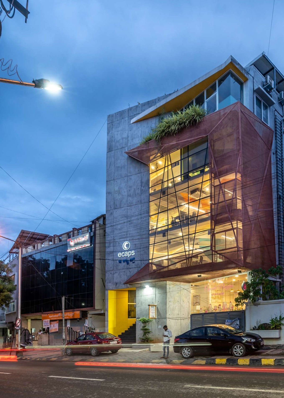
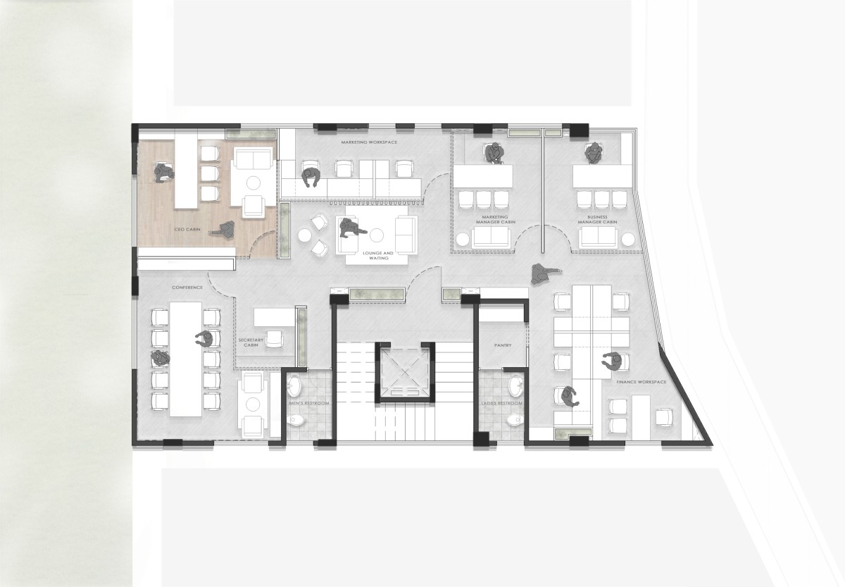
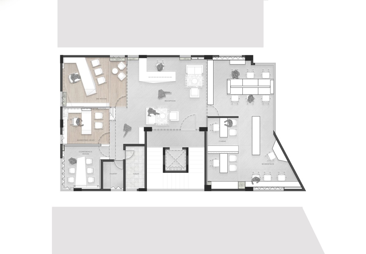
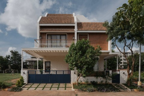
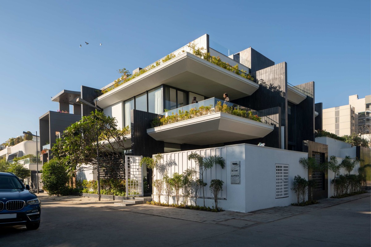
Situated in one of the poshest areas of Koramangala - the structure express itself with a sense of calculated subtlety and unwavering confidence. The structure was conceptualised for a developer, who could use the top floor as their office while the other three floors could be leased out to other businesses.
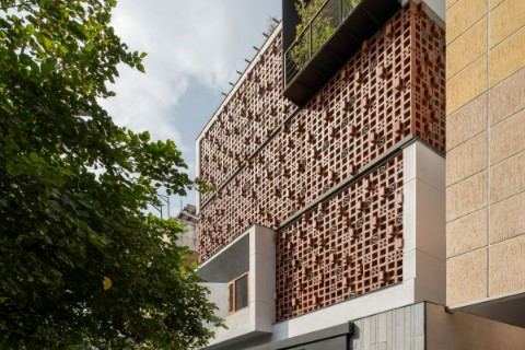
Since the clients themselves are developers, the facade was articulated such that it showcases their background, context and expertise. This is where the facade gets its essential material and finish - exposed concrete and steel. The material choice here was not limited to just aesthetic constraints rather it was a decision that could potentially help establish the authority and legacy of the client. In fact, the design narrative of the building was based on the services provided by the client - from construction to finish phase, from raw to refined. The building is an inward journey. We also did a study of the streetscape to design the facade in a way that it stands out in the street while retaining integrity and poise. In fact, the angle of the site led us in the direction of sculpting the facade so that the angular lines are parallel to the road while the structure tapers with the shape of the site.
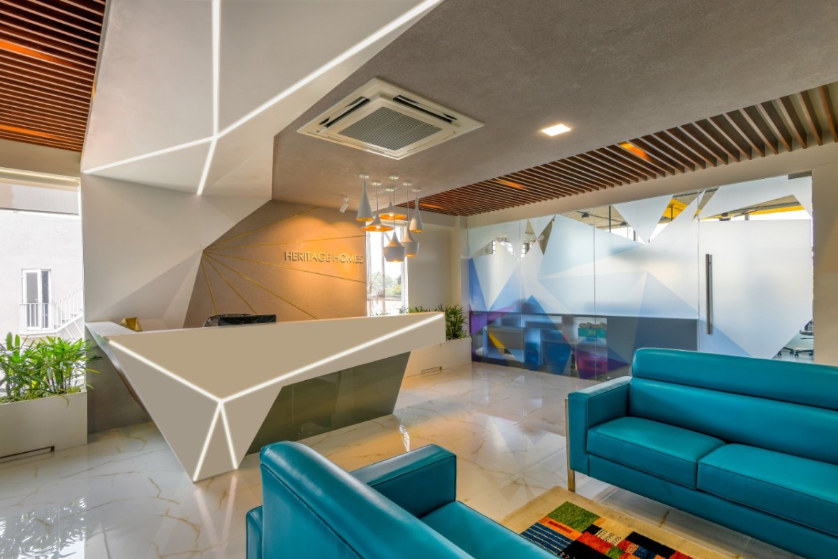
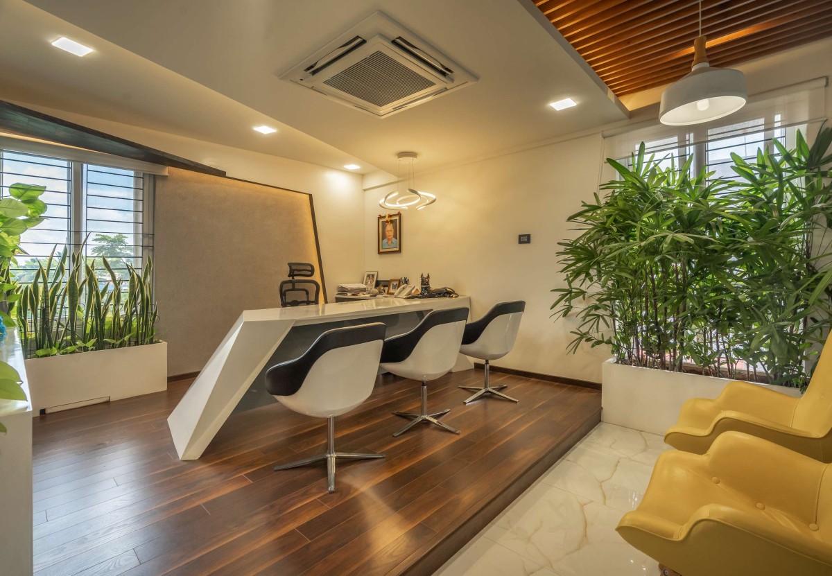
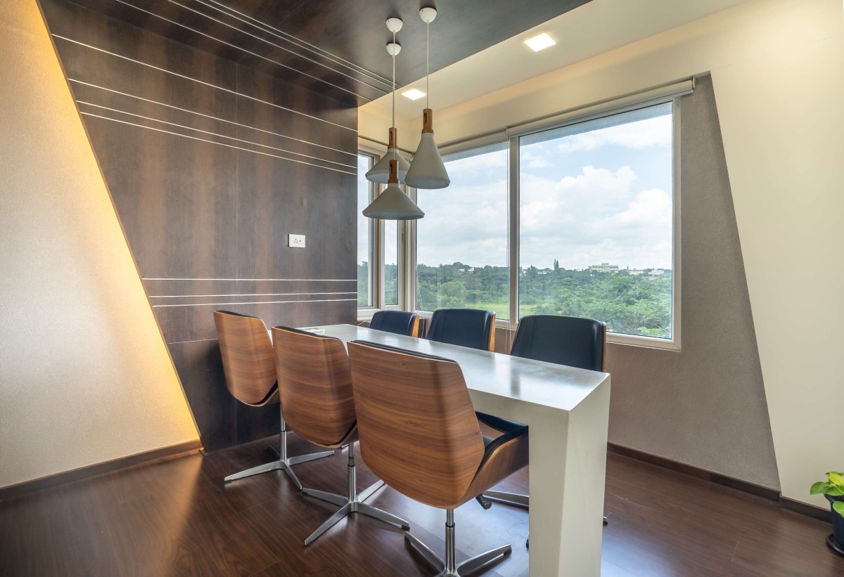
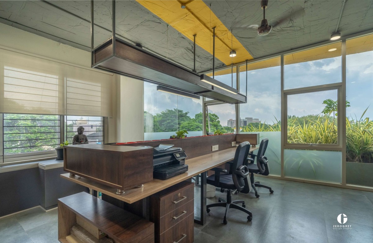
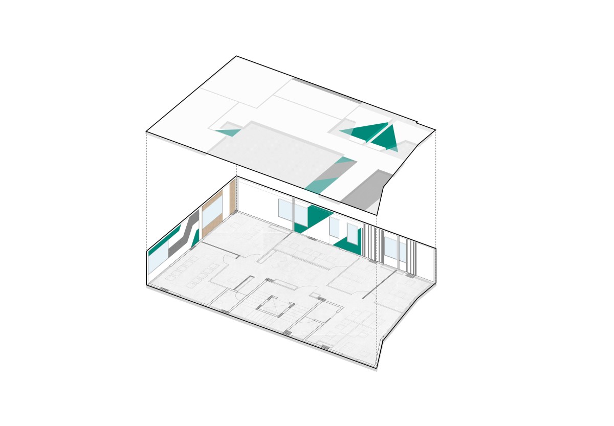
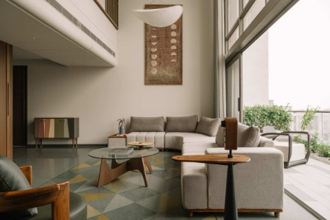
As soon as one enters, the contrast between the facade and interior becomes evident, from brutalism to intricate and polished finishes. The fourth floor - which is the client’s office - has myriad material influences playing out in unison. From Corian to exposed brickwork to copper sheets try to create an atmosphere of ease and comfort. The general layout of the space was designed as per Vaastu. The voluminous and edgy reception table with a wood panel going from bottom to top was also a statement to signify the client’s service of creating homes. The MD room and conference spaces across the building were placed such that they get ample light and a wide view of the green space behind the site.
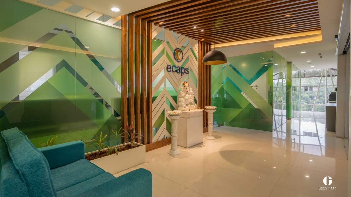
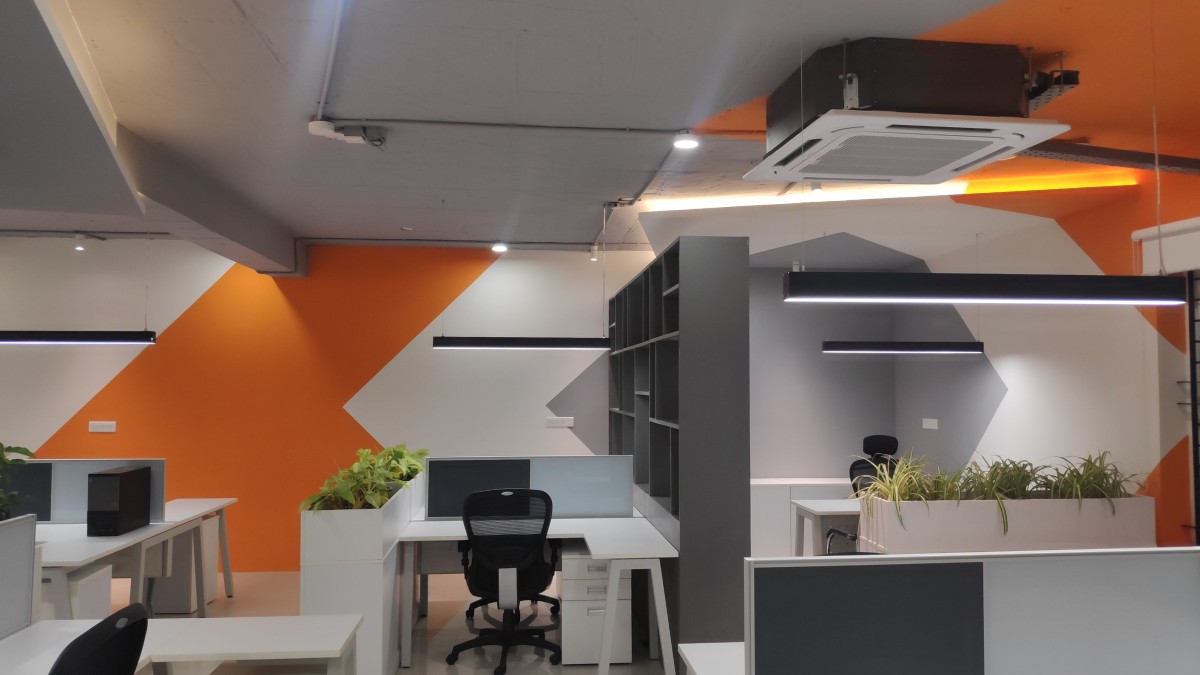
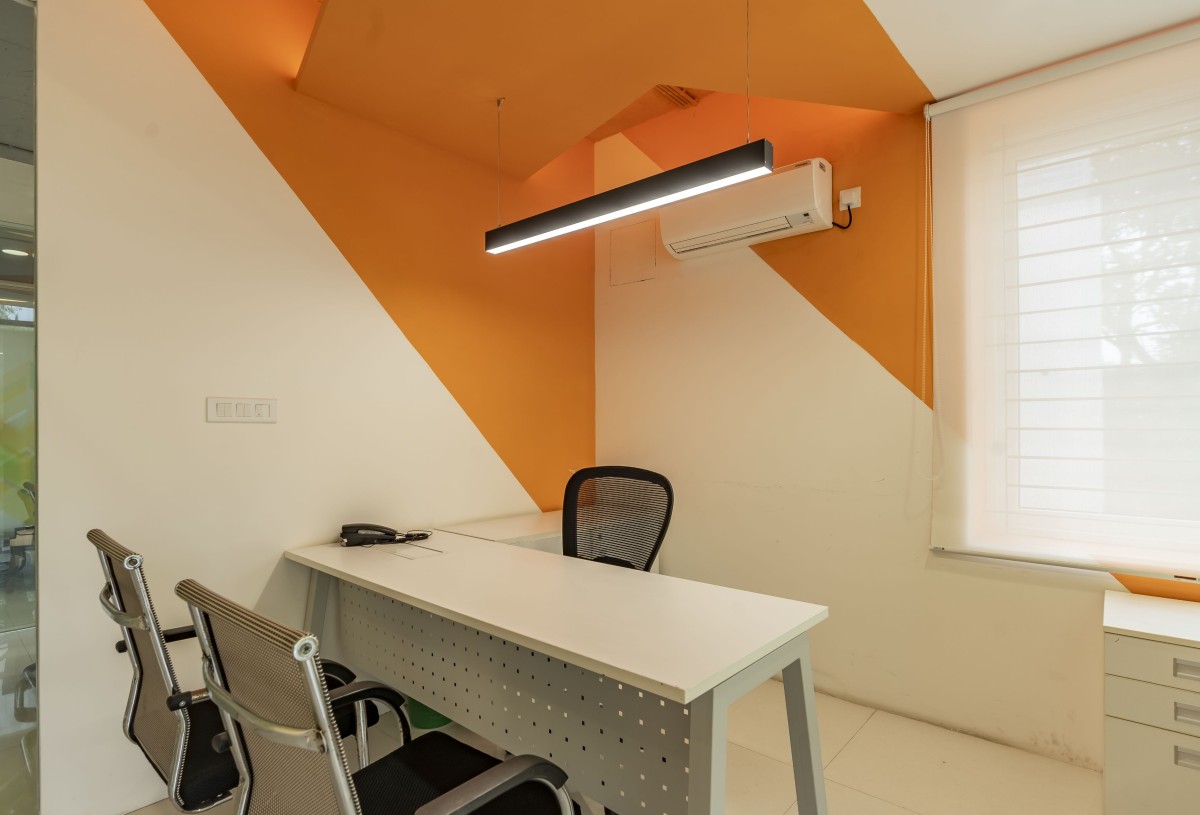
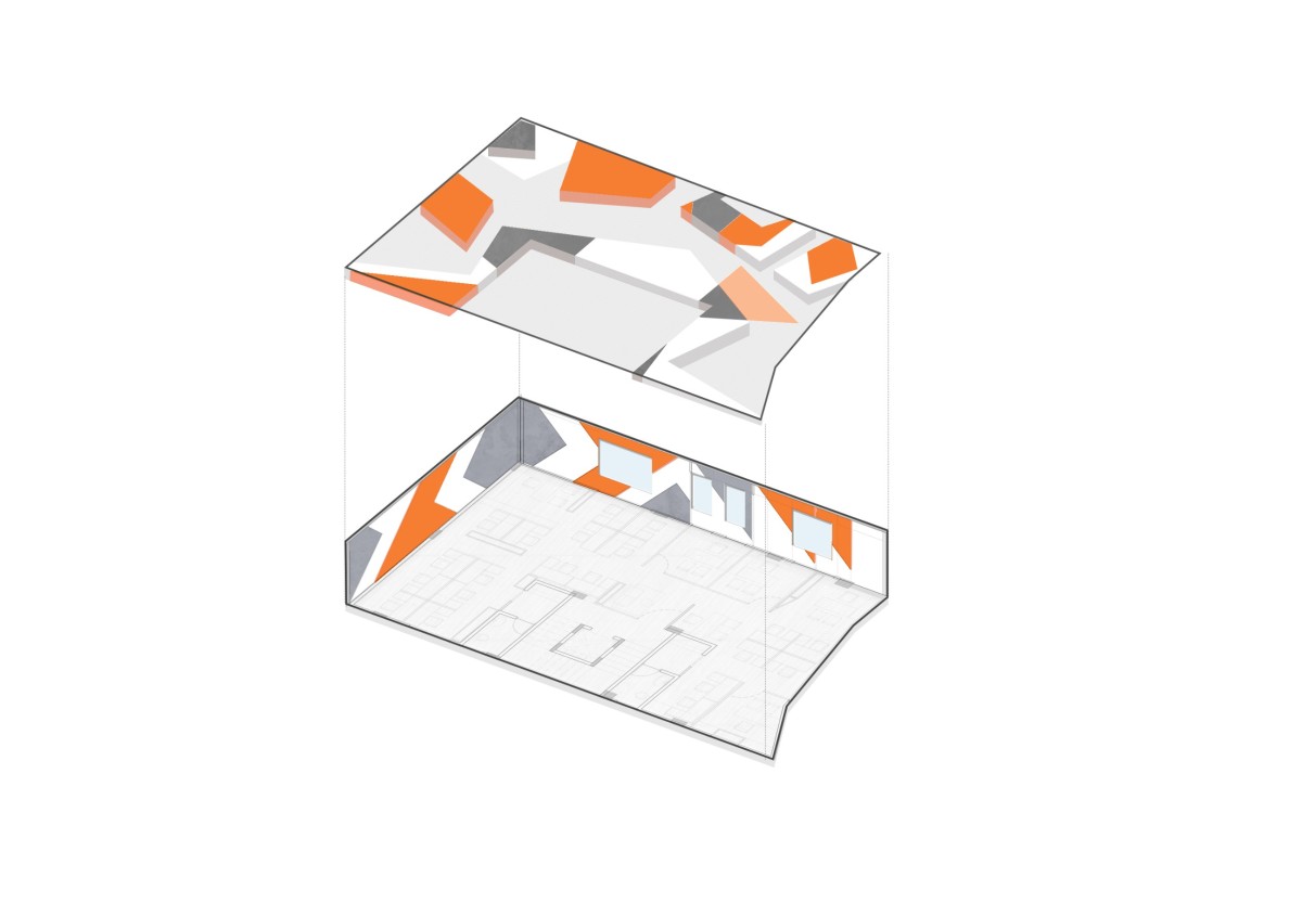
We have tried to seamlessly integrate diverse materiality through the consistent use of tessellations. This not only helps in tying together the materials but also creates a cohesive experience for the user. The MD’s table has a design synonymous with the angular form of the facade but the finishes are completely different. Even for the office on the third and fourth floor, the tessellations run from wall to ceiling, much like an anamorphic visual: creating interesting visual points of interest and also tying the exposed services to the built space. The interior graphics on the entrance gate also embodies a similar style. In addition, the storage spaces throughout the office were also designed with inspiration from the golden ratio.