Interior

2019

Photographer : Gopikrishnan Vijikumar & Kavin Prasanth

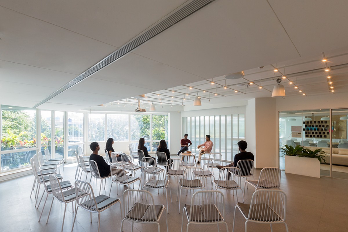
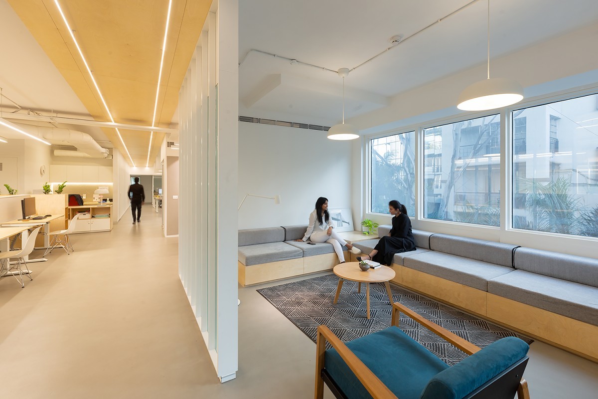
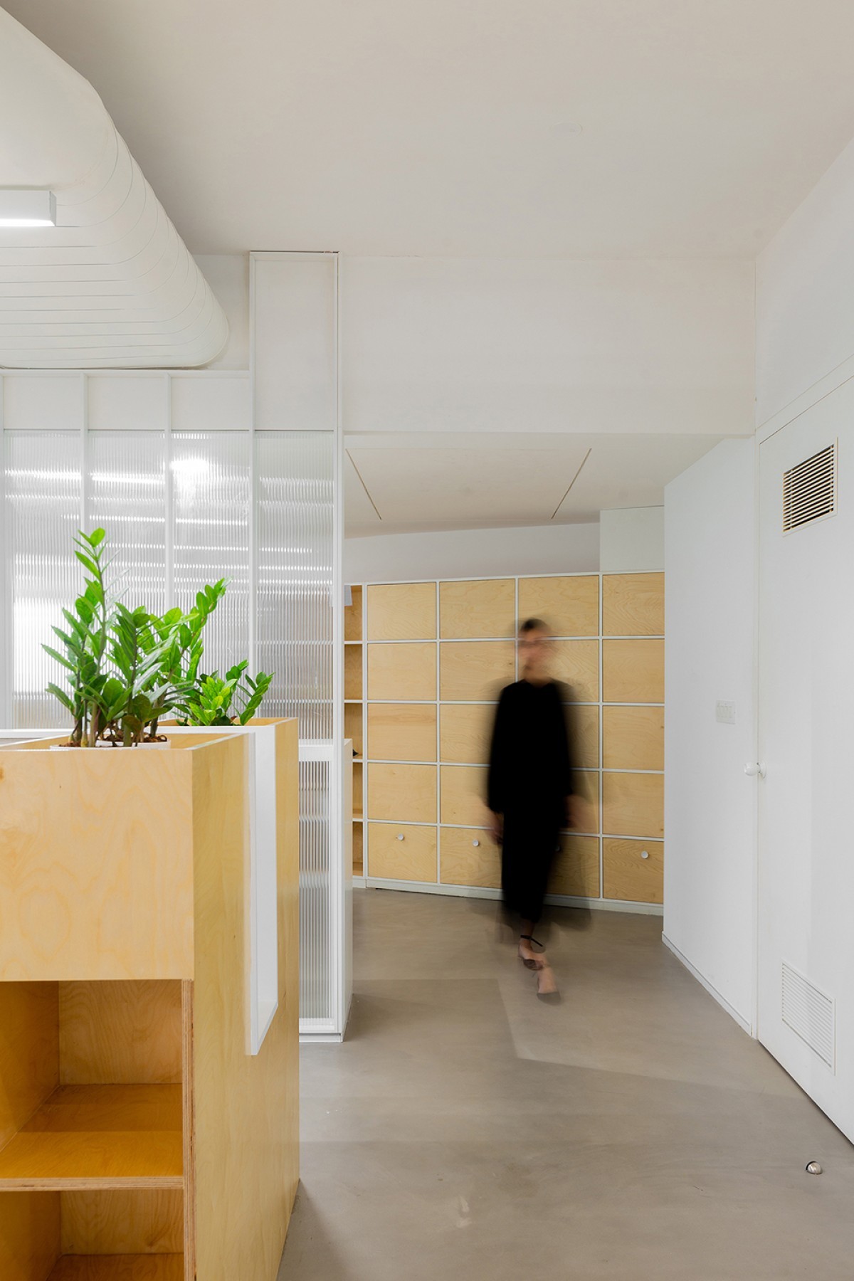
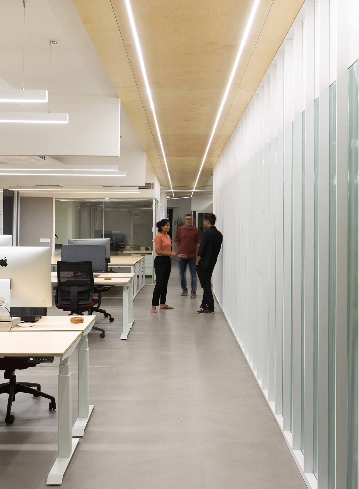
The Obvious started off as any other project, the client approached to brief about their third workspace in a row as they grew into a bigger team. As a designer, they work with a set of principles and a unique sense of choice which made them play a major role in developing the design from the very start. Further discussions and proposals led to the concept driven by minimalism, followed by the soft color palette which eventually fixated the scheme to be only white, grey with a complementing texture of birch ply, and a little green to complement the whites.

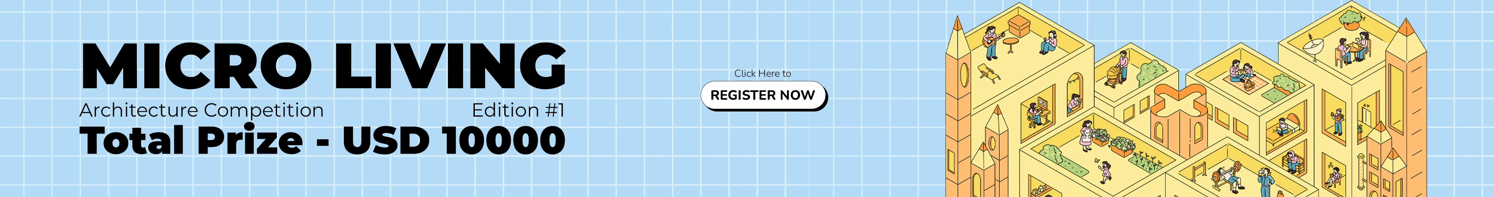
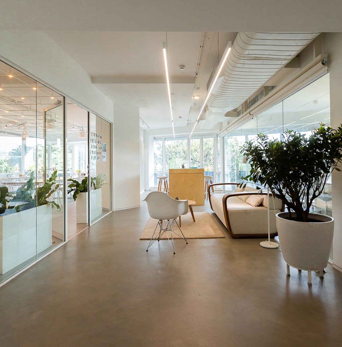
The existing site had a low ceiling which made it challenging to keep up with the notion of comfortable space, as a solution an aisle was designed opening up to the glazed façades in order to infuse maximum natural light which eventually illumined the whole office even the small workspaces.

Unlike other offices in Bangalore with sufficient area to accommodate the strength, our client believed in openness and enough space for everyone and that is the reason they opted to work on a floor plate of 6500 sq. ft; double the required room for 25 people. Though the plan is divided into parts, it follows the order and feels vast.

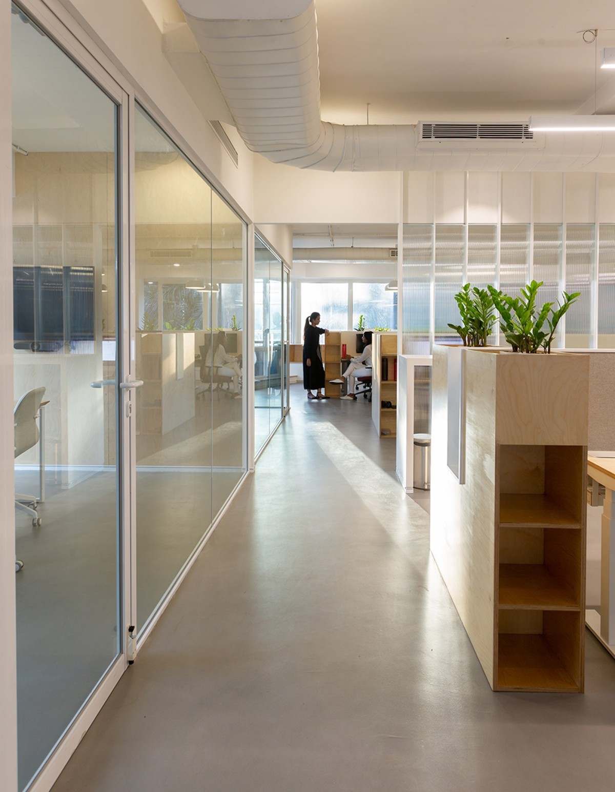
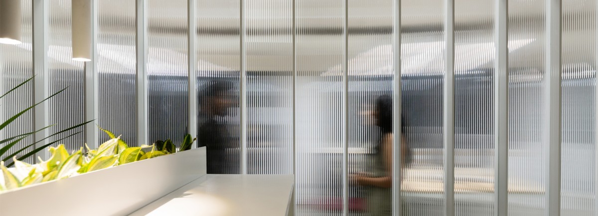
The functioning zones follow the Deep work zone, Transition zone, and Community zone. Starting with the Community zone, the entrance is designed with the mere thought of privacy while using the sunlight from the opposite façade in the best way. The intent to provide privacy as well as give a blur insight to the office encouraged the use of wide fluted glass which made a huge impact on the project, be it the shimmering shadows of people crossing by or the sunlight filtering through the translucent screen, the material creates a unique experience. The material partition is used for segregating the plan with three layers, one is at the entrance, the second one is creating a barrier between the dining and the workshop space and lastly creating a partition by joining two columns to part different workspaces for the engineers and designers respectively.

Bangalore,Karnataka,India

Architects : MYVN Architecture
Area : 6500 Sq. Ft.
Year : 2019
Website : https://www.myvn.in/

Moving further in the Community zone, the workshop space is purposely designed for hands-on, a pocket for the team to interact and create better. Whilst supporting the crafts work of local artists and adding up to the character of the space, an original Ring sofa designed by Sandeep Sangaru and some minimalist furniture from Spin were brought. On the other side of the glass is the dining area which is designed well for 40 people to have a meal on one day or to have a workshop sort of setup with a projector and shuffled furniture on the other. The layer of fluted glass adds up to the framework acting as a backdrop.


The aisle follows the transition zone consisting of one of the three pockets of workspaces, designed with a sliding folding system which has whiteboards installed. This workspace is developed as a discussion area. The conference room is kept at the entrance to present a glimpse of the work context and office culture.


The deep work zone involves the predominant workspace where the group crafts their work and motives. This includes the second workspace with the long table near the column partition designed for the engineers and the third being the one with high planter boxes for the designers, although the team believes in comfort while working and shuffles according to the needs. The requirement included a library within the workspace based on one of their principle of designing. The zone also includes two meeting rooms side by side.


While all the other parts of the office are designed with the purity of white, the washrooms are all black and represent a complementing vibe of a dark zone. The space is dark, intimate and lit enough to relax while all you can focus on is yourself.


The most relaxing feature of the space is every part of the office has balconies all around, which are flushed with green diligently. One can stroll around or attend a phone call while being surrounded by strings of green. The facades are fully glazed, which encloses the office as an entity and after stepping out in the balcony one can feel the city. The balconies are kind of a buffer zone creating a soothing filter; refining one’s vision while looking over the polluted city. The front side balconies are used for flushed green around the office whereas the rear side balconies fulfilled the purpose of the utility area.

The plan is flooded with natural light which enhanced the idea of minimalism, artificial light would have not made a such an impact. Even the grey cement epoxy goes well with the concept whereas adding green complemented the palette and completed the picture as a whole. 


Most Visited Articles


Subscribe

Get our latest article and updates delivered straight to your inbox.