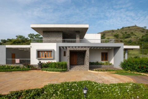
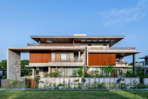
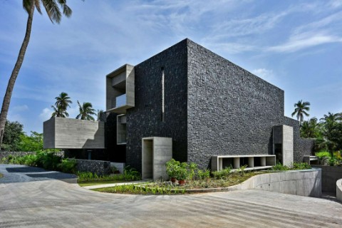
It has to be modern and new but is comfortable, looks expensive, that’s how we named it Neoplush. It’s a mix of modern with a little traditional. We had to design this space considering two different country resident’s and generations choices into the same house. Located in Rajkot, this residence is in complete contrast to the context and one might figure that by entrance itself. Mostly, we have noticed a certain resistance towards use of Black in residences unlike here.
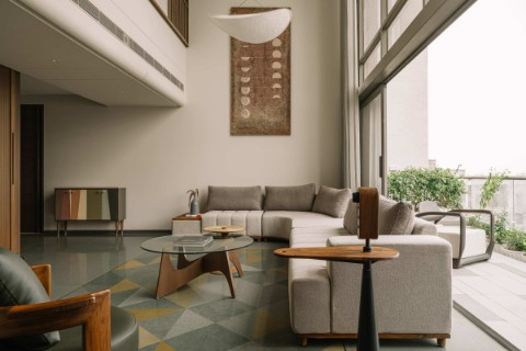
We have some amazing and gradual transition of monochrome to colour in the whole space with some good attempts to play with different textures and finishes. As you get on the floor, a good volume of black and white shoe rack + seating grabs your attention which stands against a light grey wall. The grey colour continues to be present until you see a glimpse of the house through a light grey French door with enough glasses to give you a gist of the largest area of the residence.
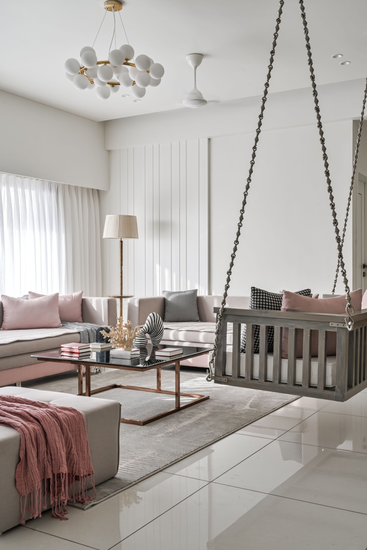
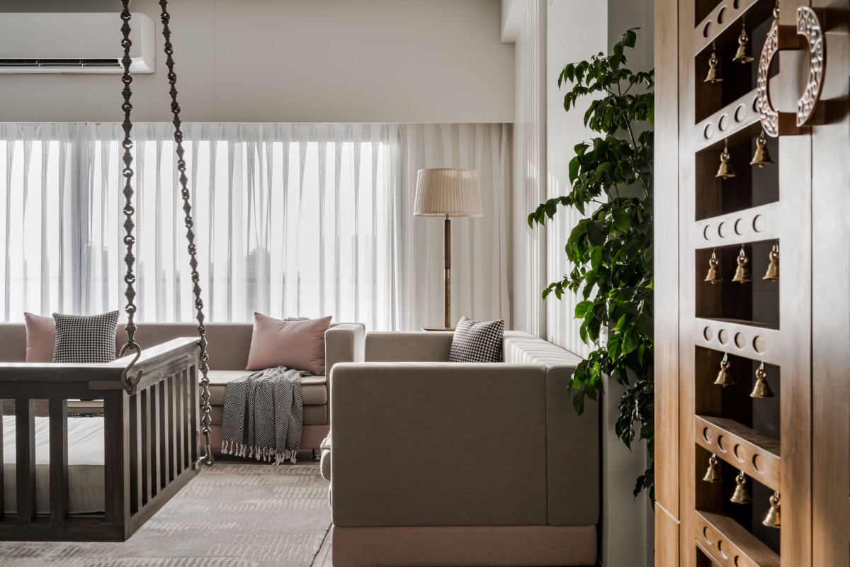
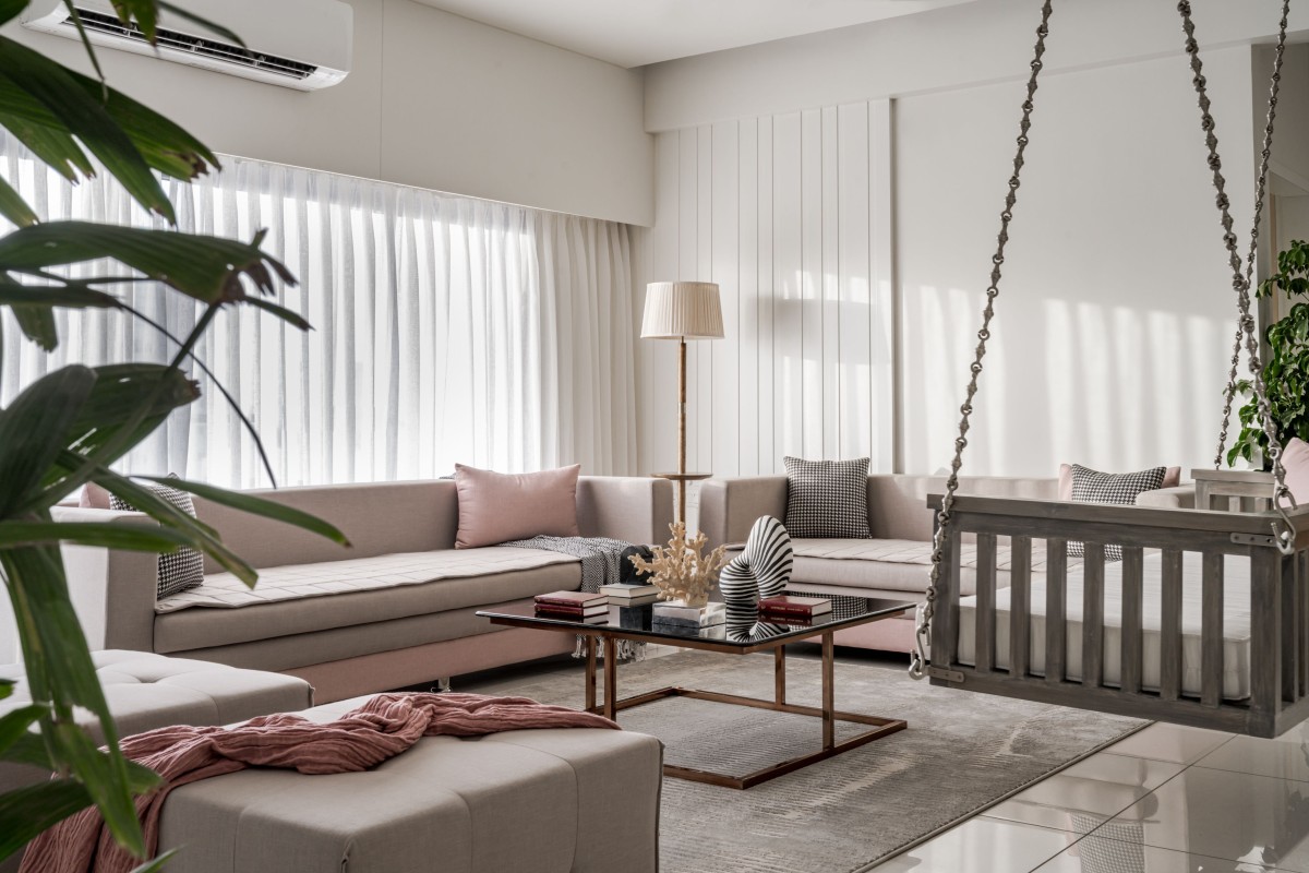
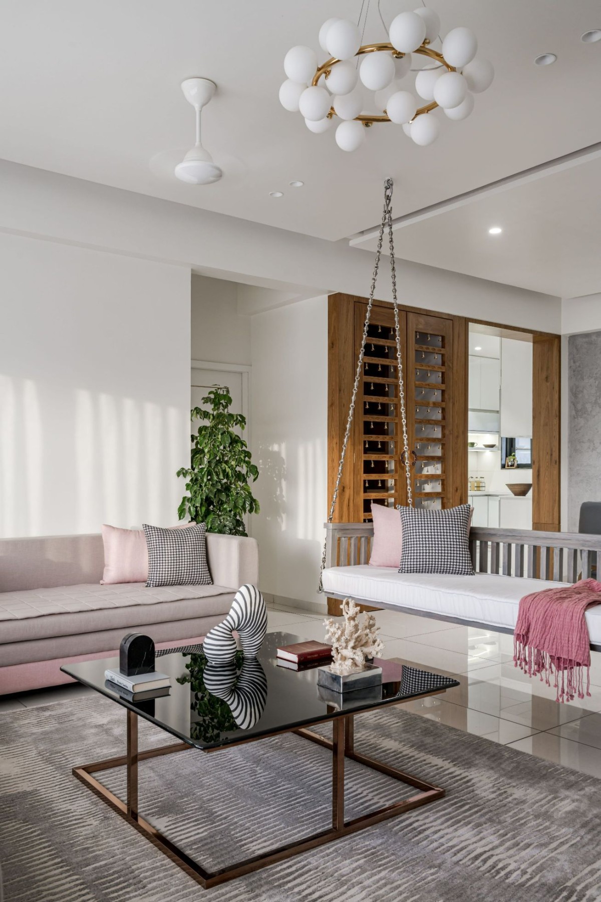
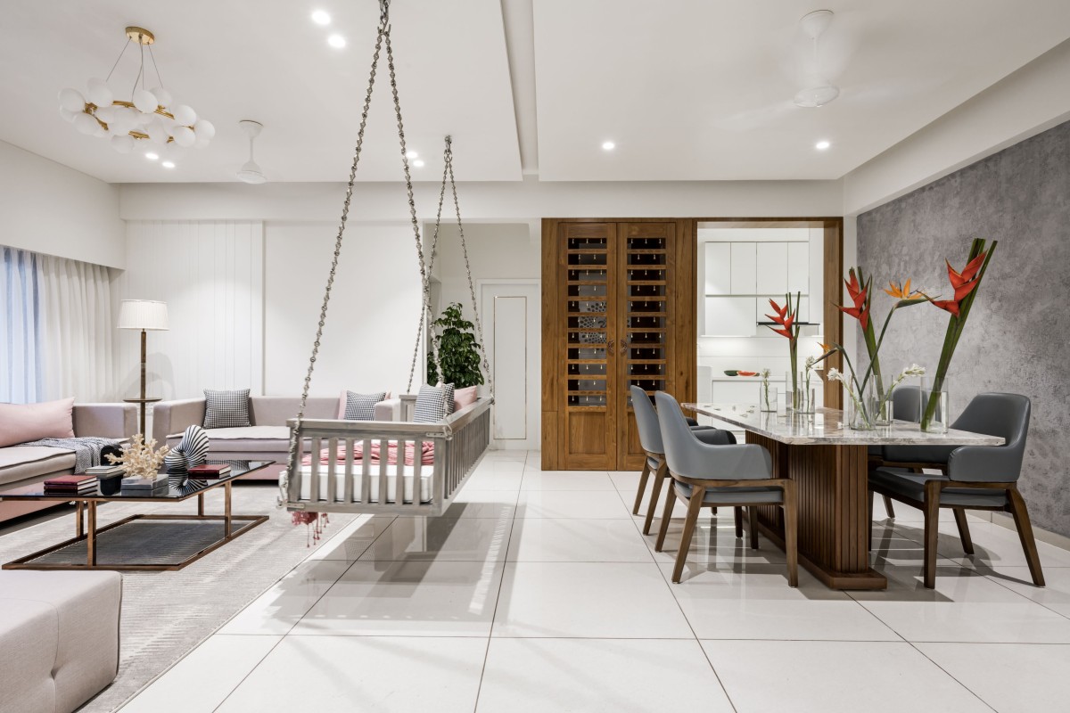
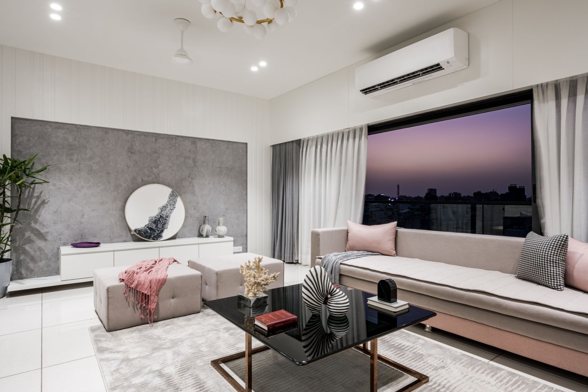
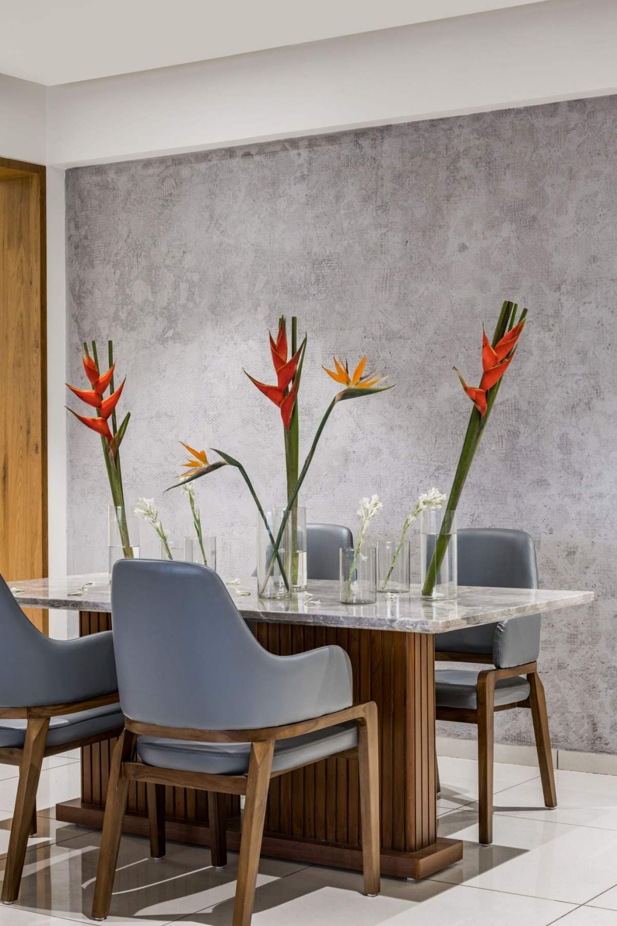
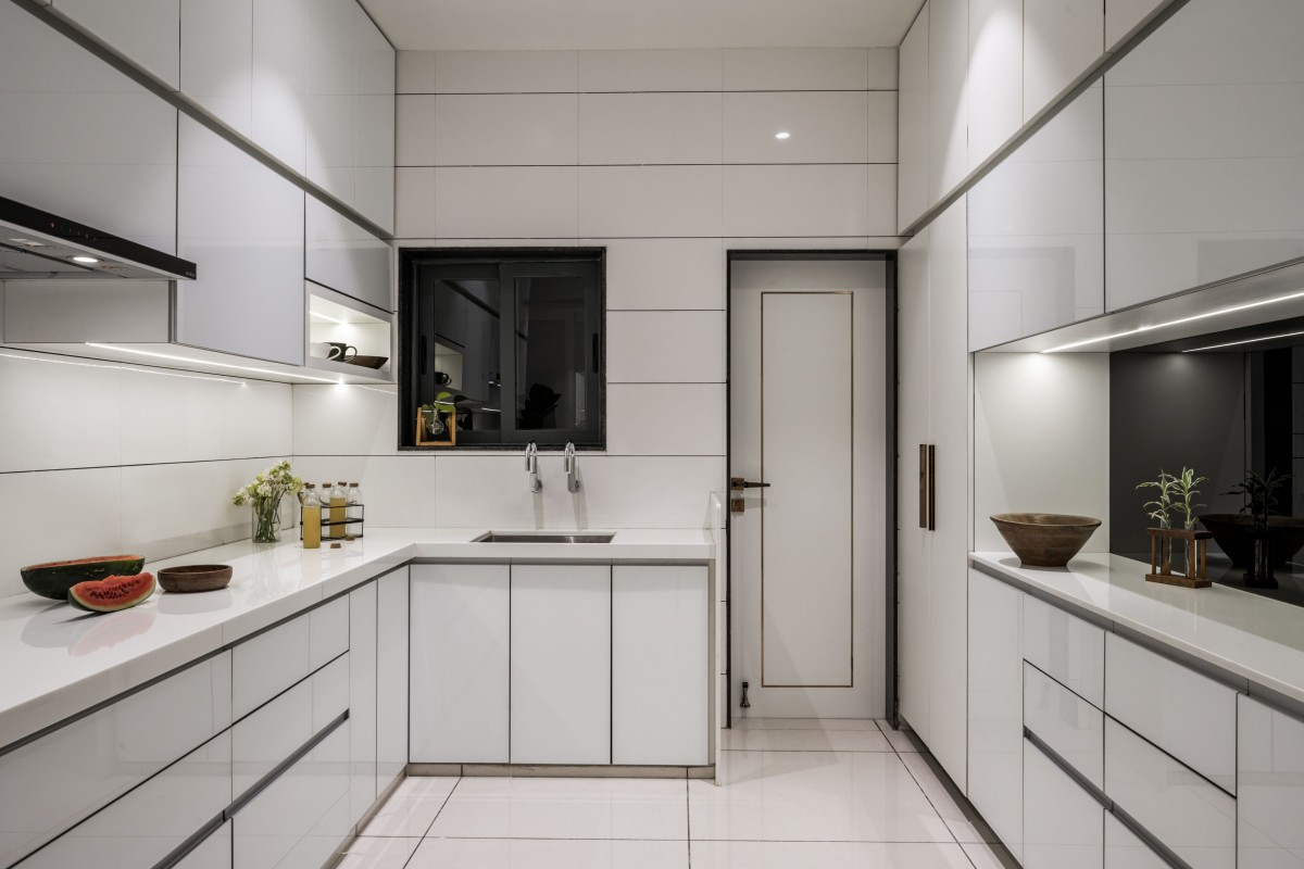
As you enter, the temple area stands out in a rich wooden tone standing alone in contrast to white walls, ceiling, and kitchen. To give out some traditional feel to parents who mainly reside here, we made the temple out of veneer which is right in front of the main door and would never fail to grab your attention. And to match the wooden tone, we added a wooden dining table on one side and a wooden table lamp on the other. The living area also catches your attention with a very raw and patched concrete texture on the entire dining wall as soon as you enter the space. Further by the informal living, one can see a very polished matte texture of PU coating on MDF contradicting the raw and rough concrete texture within the built TV wall.
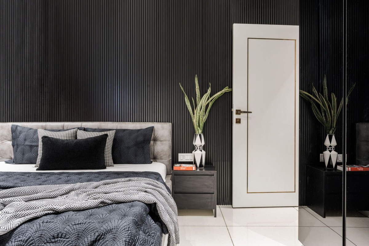
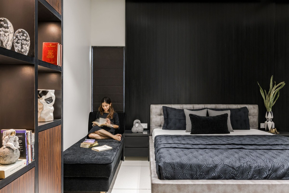
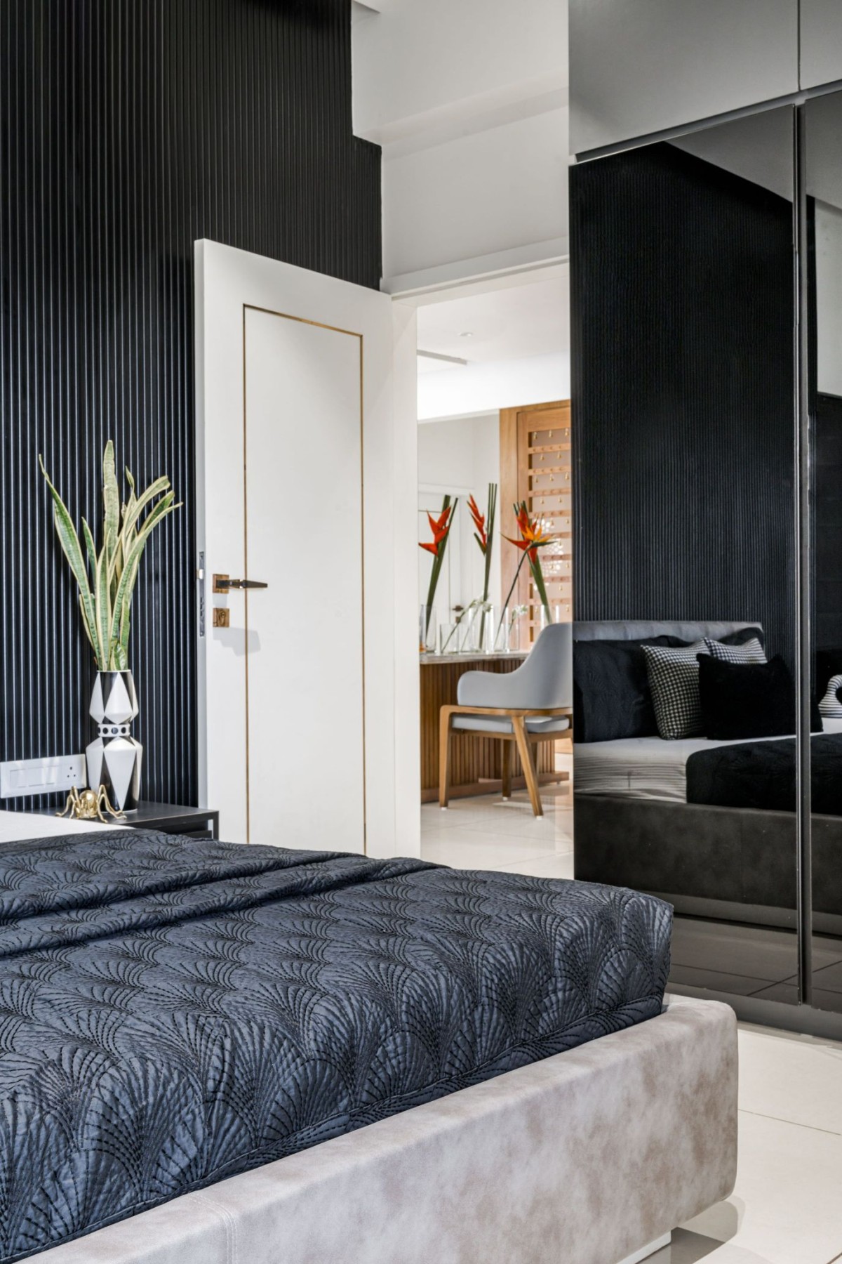
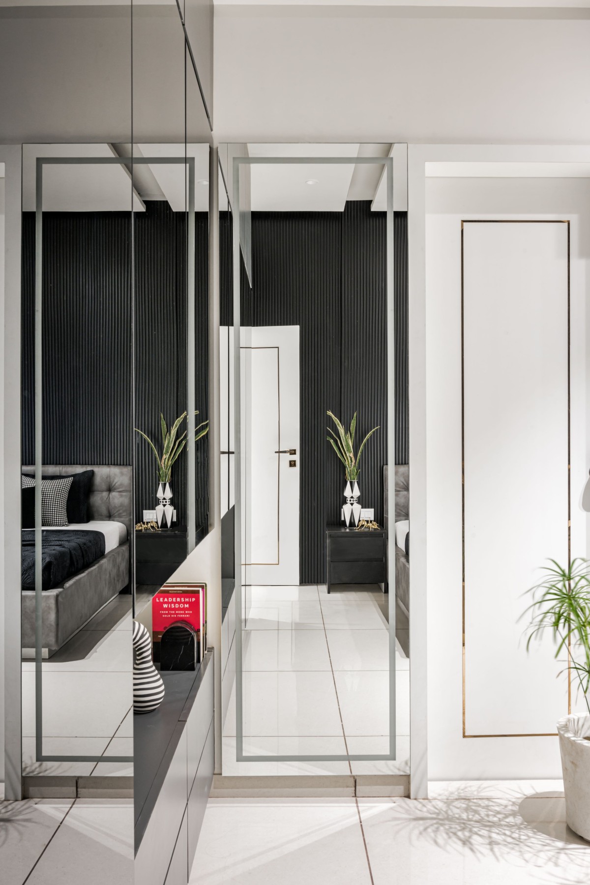
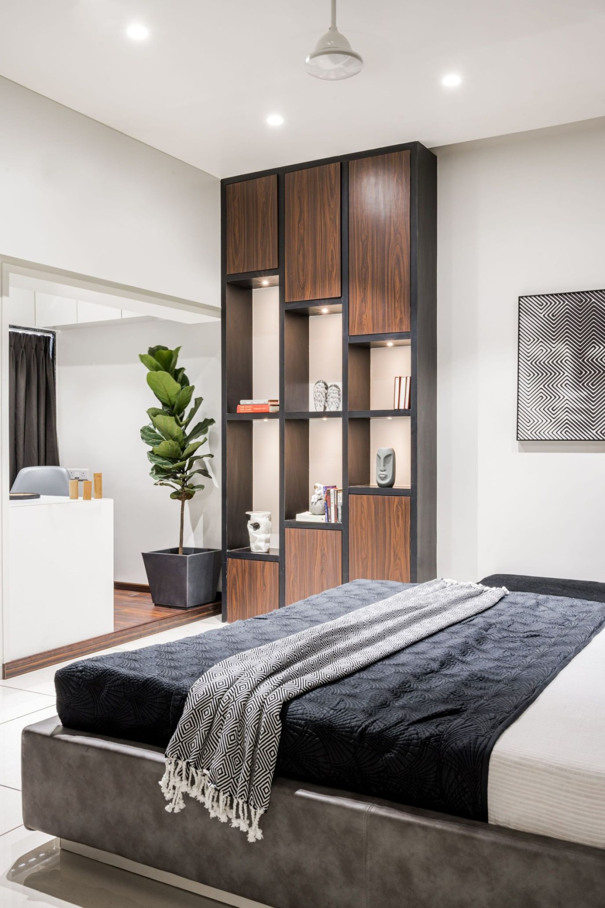
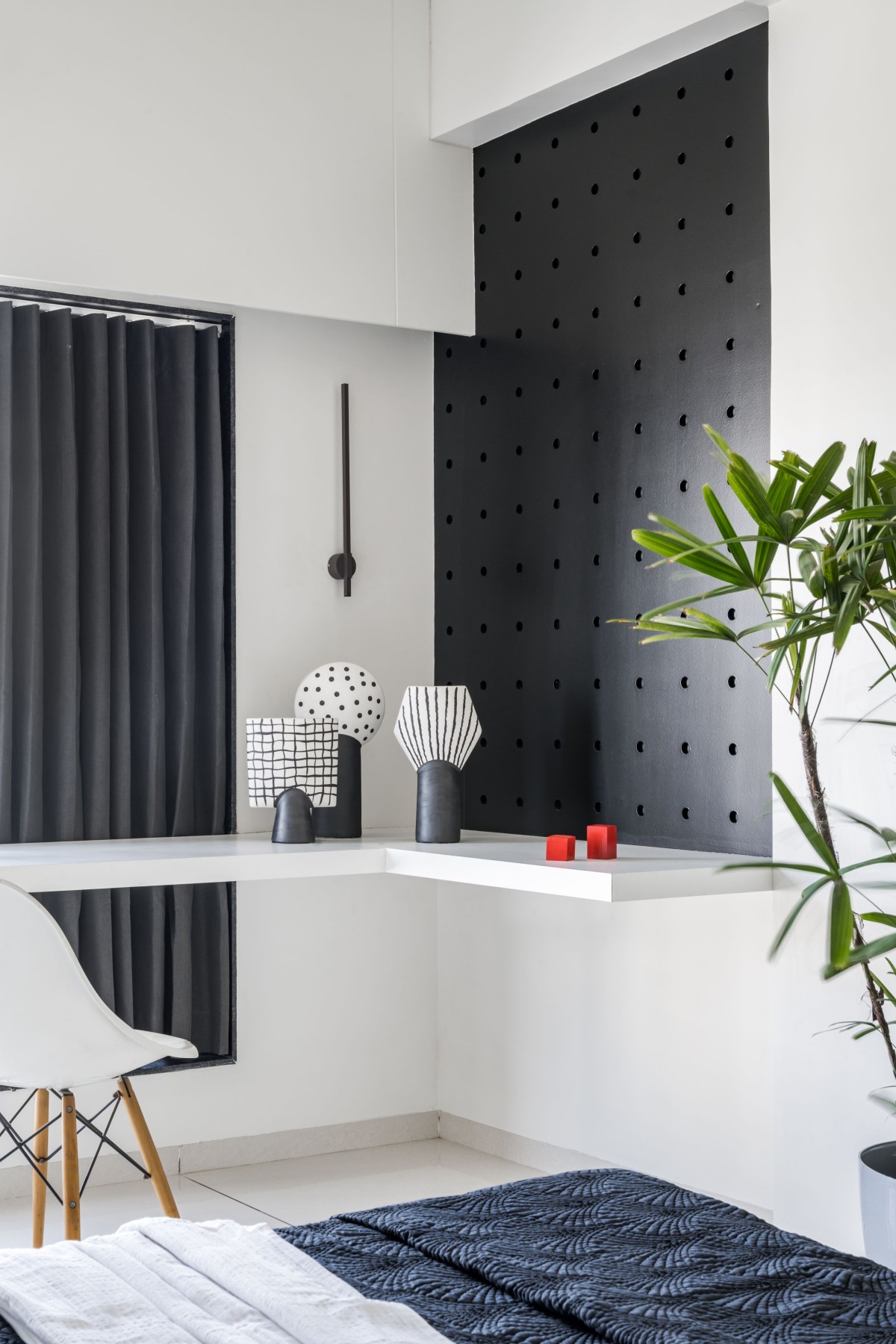
Facing the temple, the left side is where the informal living area is situated and the dining area is on the right. Going further right, crossing the common basin area, one would find a tall storage unit. Going right of this storage unit is the elder son's bedroom, which has a huge black fluted wall that takes our breath away but without compromising on making the room look smaller.
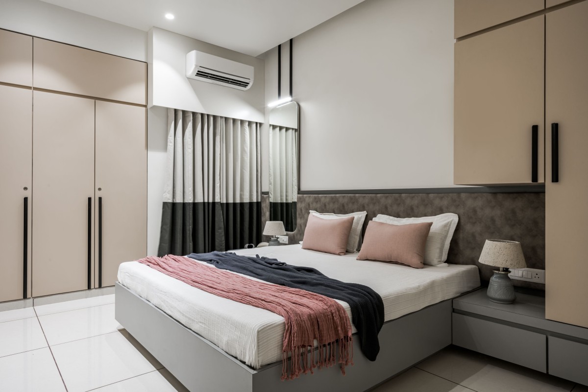
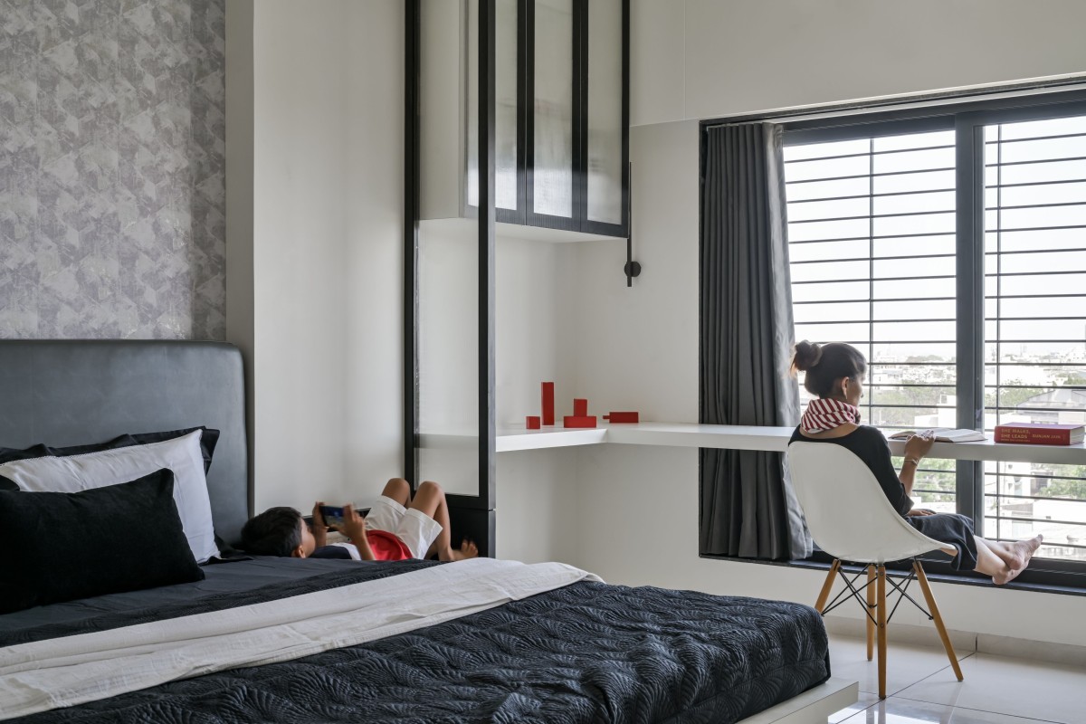
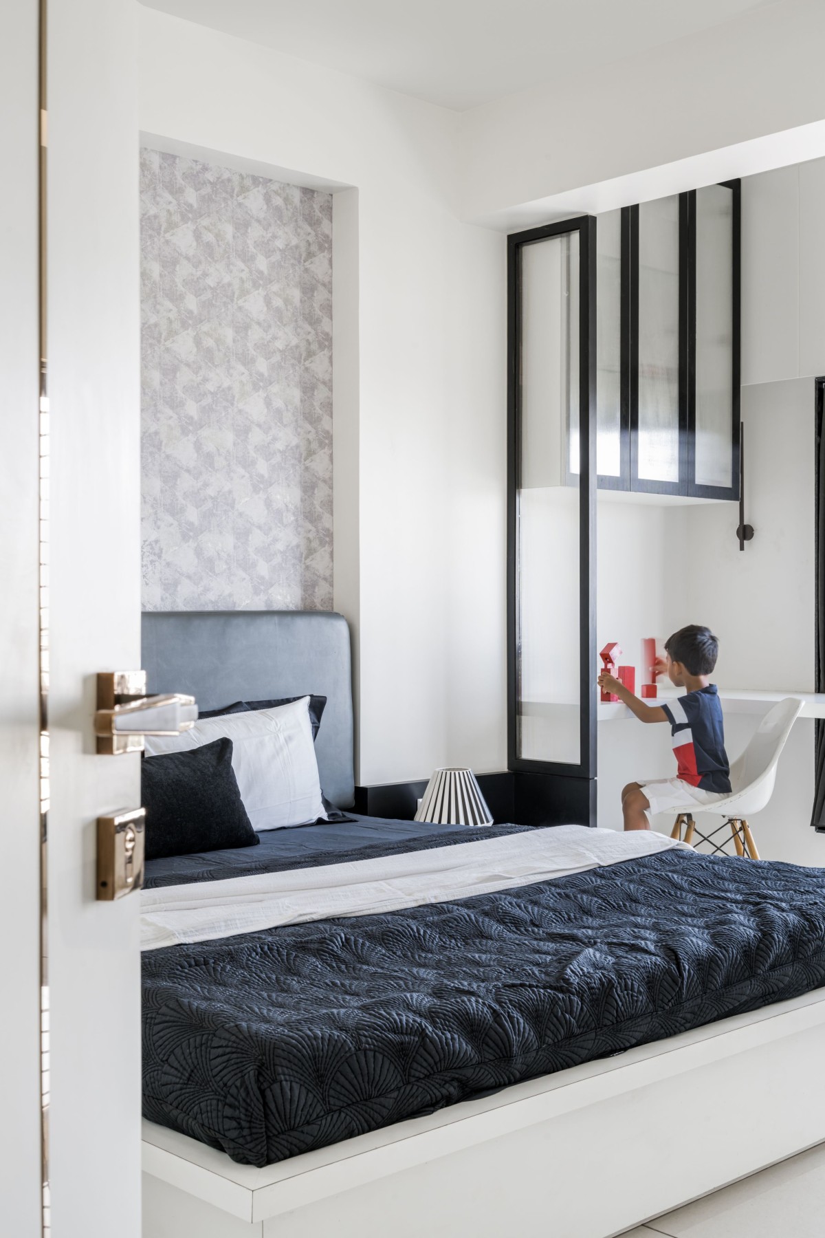
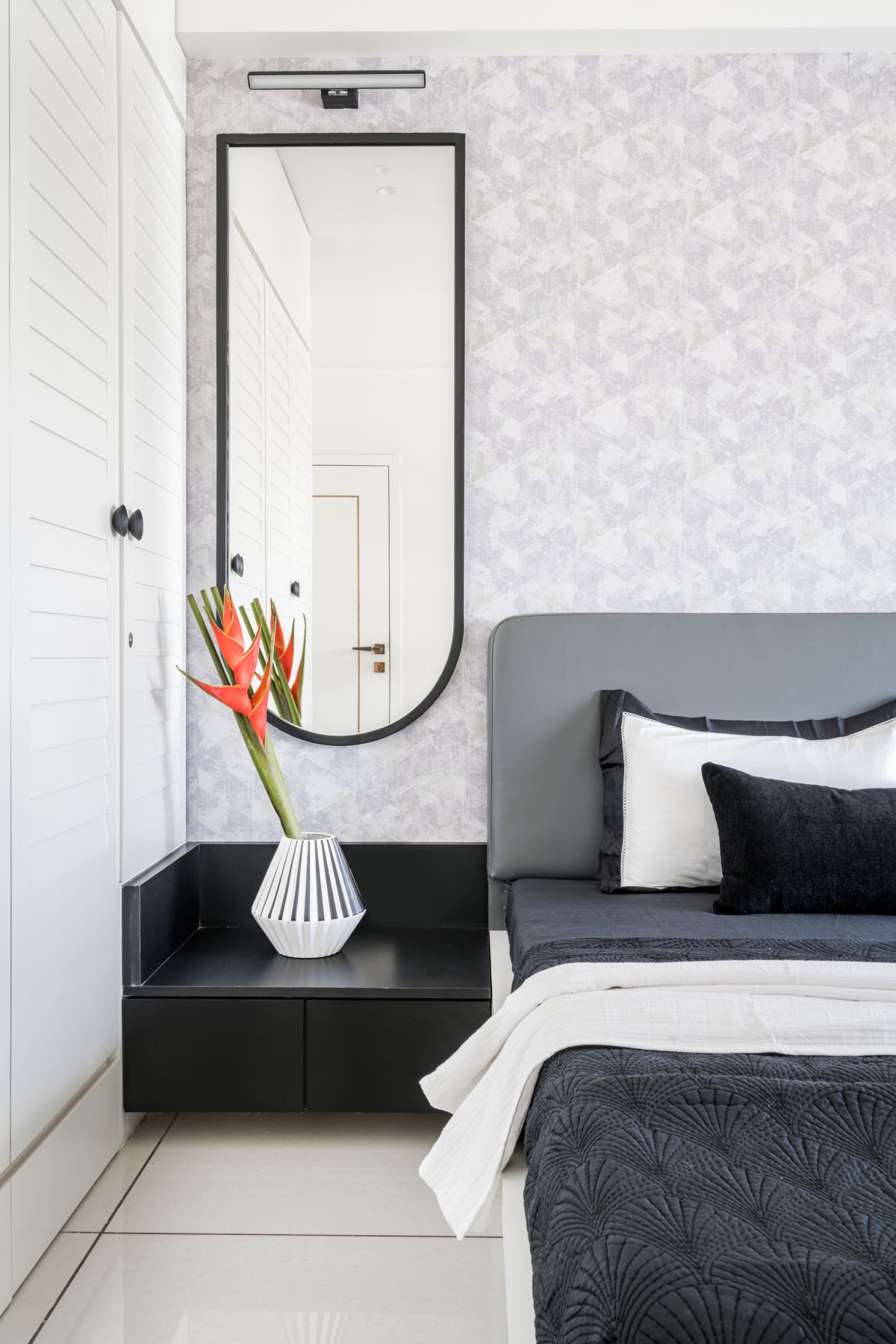
Towards the left is the younger sons' bedroom, which is black & white. It has wallpaper at the bed wall, which is matte, subtle, and does stand out since the rest of the elements are majorly white.